User-Centric Visualization in the Service of Explainable ML+AI
Visualization is the simple encoding of information into (mostly) visual representations.
The process relies on mapping data fields into visual elements through available
encoding channels. This encoding channels include position (x,y,z), shape, size,
orientation, and color. The ability to discriminate when to use particular encoding
channels is guided not only by measurable perception metrics from cognitive
studies and general visual layout strategies and methodologies learned from
graphic arts, but ultimately comes down to the particular goals of the user
viewing, inspecting, and interacting with the crafted visualization tools.

COURSE: [
Visualization | Big Data Analytics | Caltech 2019] by Santiago Lombeyda
Novel and creative visualization representations become useful when paired with
meaningful user goals. Thus, user-centric methodologies can be successfully
utilized to create informative interactive visualization solutions at most steps
of ML and AI processes, where interacting or understanding the results (or partial results)
is visually meaningful on its own or in the context of other results.
This poster will explore solutions created for different states of ML processes,
resulting from user-centric design approaches.
user centric a| CURATION OF TRAINING DATA SET
In the service of creating a training dataset discribing the taxonomy of bio masses
and their possible classification as tumors. Given the importance for the user
to understand the 3D spatial relationships of the data, and the need to inspect
the structures while preserving context of the overall structure and placement,
we arrived to a Virtual Reality based solution.
We created OVS+Tumor: a seamless VR environment designed for intuitive
interaction aiding in the complex task of parsing through 3D CT-scans and
annotating candidate tumors. Through interactive subsetting and on-the-fly
iso-cloud generation, a wider range of users beyond just domain experts
(radiologists/surgeons) can generate a viable machine-learning training dataset.
courtesy of CD3/caltech, JPL/NASA & EDRN/NIH
[OVS+TUMOR] by santiago lombeyda
researchers: EDRN Endeavor at JPL/NASAPI
user centric b1| DATA EXPLORATION OF ML PROCESSES
Self Organizing Maps (SOM) is an unsupervised machine learning technique that
has become quite valuable for understanding a wide spectrum of biological processes,
as it produces a "low-dimensional representation of a higher dimensional data space,
while preserving the topological structure of the data". Understanding how a researcher can
make best sense of the SOM data can be as straight forward as finding clear
visual mechanisms to convey the mapped data into an interactive system which
responds to the natural queries about specific populations that researchers
would have after gaining a clear understanding of the overall structure of
the data. After understanding what the needs to the researchers were, and how
the representation would guide them into their exploration and analysis,
an interactive web based tool was easily deployed to help answer
researcher questions.
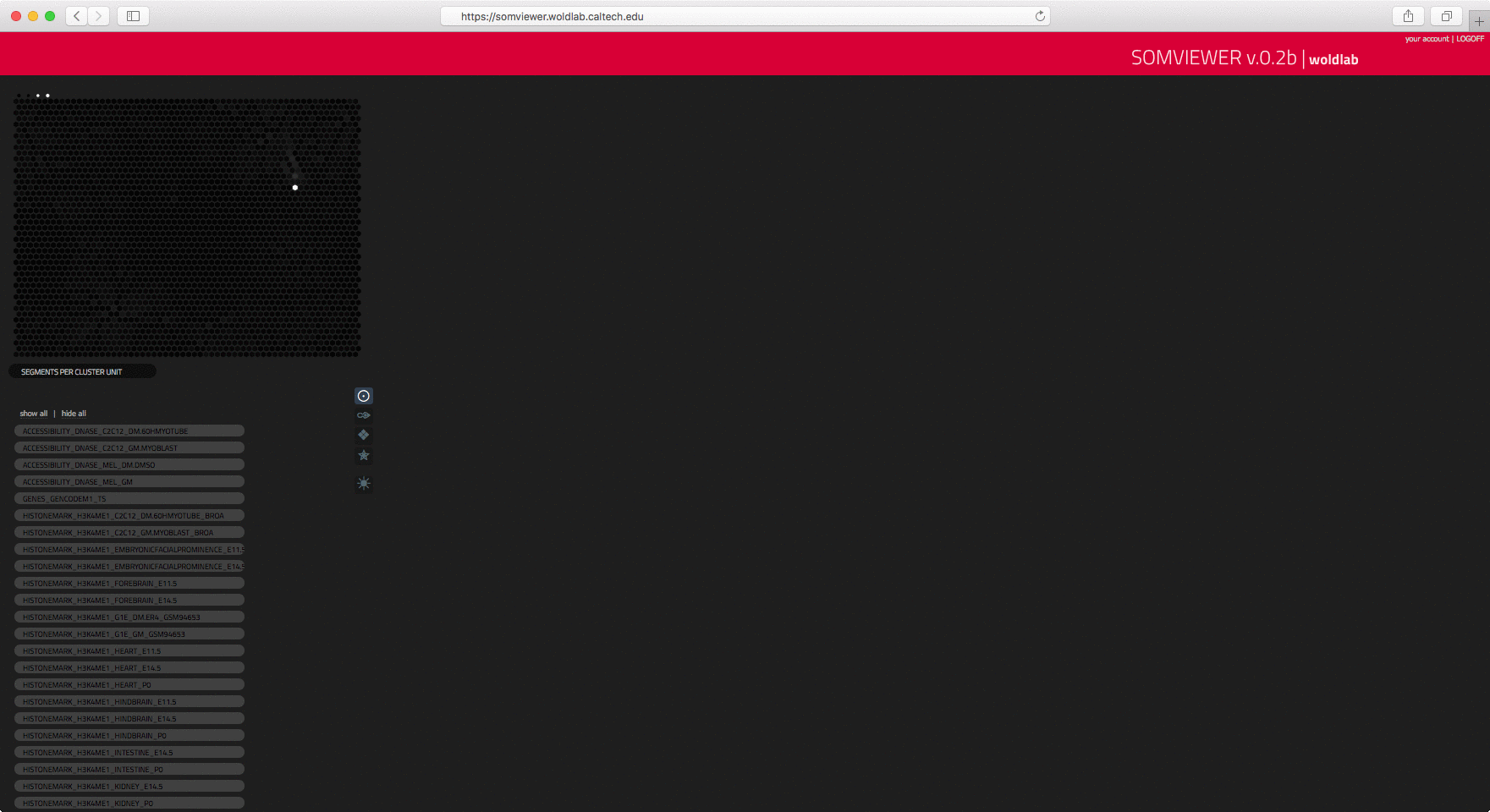
courtesy of WOLDLAB/caltech
[SOMMAPVIEWER] by santiago lombeyda
researchers: Gilberto DeSalvo, Barbara WoldPI
user centric b2| DATA EXPLORATION ENGAGING ML PROCESSES
PIXLIZE (formerly PIXELATE) is a microXRF visualization and analysis tool built for NASA JPL's
Mars 2020 rover PIXL instrument team. The tool is built to enable the team's
search for signs of past life on Mars, as well as to explore the red planet's
geologic history. Thus, the users central need is to have a tool which could
visualize the spatial relationships and concentrations of elements in Martian
rock samples in order to enable the search for signs of past life on the red
planet.
The project tested a diverse range of ML processes, with most revealing some level
of insight. These included t-SNE, PCA, and k-Means clustering. However, it is the
blending between human and machine intelligence that raises the major challenges.
(See [PIXLISE-C: Data Analysis for Mineral Identification] for more detailed analysis.)
For instance, while ML processes in dimensionality reduction, like t-SNE, utilized
in the initial understanding of the data relationships, we encountered that
a much higher priority for the user was the ability to compare locations and
detect anomalies in the spectroscopy. Thus, a main feature of the current
version of PIXLIZE --which is actively being used to study the data from
Mars 2020 rover-- is a Variational Auto Encoder.
courtesy of JPL/caltech/NASA
original [PIXALATE] by david schurman, pooja nair & adrian galvin, as
part of the [DATA2DISCOVERY JPL/CALTECH/ARTCENTER] program mentored by
scott davidoff, santiago lombeyda, hillary mushkin & maggie hendrie
researchers: PIXLJPL/NASA
user centric c| ML SPACES
The DARPA Data Driven Discovery of Models (D3M) program automates methods in
data science to enable domain experts to incorporate their knowledge into the
modeling process and create meaningful and valid predictive models of real,
complex processes without the need for expert data scientists.
All data from the D3M AutoML explorations is available for exploration through
MARVIN. MARVIN is a visual interface that helps you navigate the rich D3M
AutoML ecosystem. Powered by the metalearning database, which captures all
assets, pipelines, and experiments run, MARVIN acts as a frontend to help
explore and analyze metalearning resources.
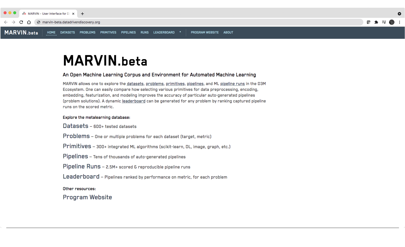
MARVIN allows one to explore the datasets, problems, primitives, pipelines,
and ML pipeline runs in the D3M Ecosystem. One can easily compare how selecting
various primitives for data preprocessing, encoding, embedding, featurization,
and modeling improves the accuracy of particular auto-generated pipelines
(problem solutions). A dynamic leaderboard can be generated for any problem by
ranking captured pipeline runs on the scored metric.
Recognizing how a user chooses to interact with such a rich database, has
led to solutions from simple (simple barchart) to complex (comparative exploration
of different pipelines) that can be tackled at different levels of granularity
of the data, at different levels in the data exploration, and targeted to
different user groups.
courtesy of JPL, D3M, & DARPA
[MARVIN Visualization Components] by sami sahnoune, santiago lombeyda, and brian wilson,
utilizing base graph layout from D3M/NYU [PipelineProfiler]
researchers: D3M PROGRAMDARPA
 caltech.edu |